Thursday, September 9, 2021

The adventure of 2 asset portfolio and correlation!!!!

 Hello guys, 

A quick project I made well I just learned about it too so why not make and share it!!

So it's about the Markowitz portfolio theory, you can search about it on a book or google. I'm not explaining here..

So to make a portfolio from 2 assets the correlation affects the risk that would come up from the entire portfolio, if a portfolio is highly correlated then the risk obviously goes up kinda like leveraging. If the correlation is low then we get diversification benefit from it, and if the correlation is negative the Voila you have reduced the risk more than the individual assets you increase the weight or exposure you get more diversification.

So I wanted to just see how this looks in real life other than book diagrams so I made them. I used my asset correlation matrix to select asset classes.

Positive Correlation Near perfect correlation:-

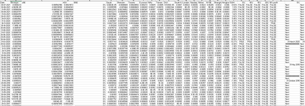
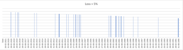
I wanted to use Nifty IT and Nifty as the correlation is .95 but I didn't get enough data on it so I choose a nifty and nifty bank, I took the returns, and SD calculated the portfolio risk and plotted it. The returns are so high and nice here as I didn't actually earlier knew the timeline to pick so I took 10 years monthly returns so these returns are normal over a 10 year period.


So you can see the line is just a straight line which shows in this portfolio as you increase your portfolio weight in this to more risk you get rewarded with higher returns. I have not added any risk-free asset cause you know why..

Now moving on so now a challenge for anyone who has read it till here, I couldn't find an asset with a negative correlation other than currencies and I guess the FTSE index might do the trick there too, but if you find an asset with a negative correlation please do tell me.

Now actually moving on to assets with a low correlation like normal assets do, so I have here NIFTY and TCS to demonstrate, a bit of change here I took 5 years' monthly returns cause I wanted to explain a bit more here. So the return and SD of NIFTY are 33% and 5.31%, TCS return and SD are 43% and 7.16%. The correlation of both assets was .49 so not a perfect correlation. So I did all the excel work like earlier and plotted it in a graph to get the Efficient frontier. 


So here it is, our Global minimum variance portfolio is observed at a return of 35.05% with an SD of 5.114% so yay we achieved diversification, now I need to make the optimal portfolio which depends on utility and other factors so I'm not taking utility here, the theory assumes borrowing and lending happen at the same rate but DOES IT!!!! so as the deposit rates are too low so I'm taking lending rates and for that, I used the most common type of loan an individual can take for doing this and which was personal loans at 24% this is an actual rate take from a bank. by using that I made the tangent line from which touches the point of our optimal portfolio with a return of 35.99% and portfolio risk of 5.137%. 

From this what I got is the portfolio offers diversification, correlation matter, and you can make a sweet high yield portfolio with lower risk very easily. 

I do want to make a portfolio that not only takes 2 assets but takes the entire universe its a very big project for sure but also fun, and that's why we do this too.

So there it is my small project which took  2 weeks to make and few more days to publish, I will see you later meanwhile I hope your returns are high and your volatility is low, and keep hunting for wild things in this market. Goodbye.

Saturday, August 14, 2021

An overview of the Global Stock market. WHY DOES IT FALL!!

 Hello, it's been quite a time since ai posted any project-related finance. So here I'm!!

Well, to start I wanted to go big with this one so I WENT BIG!! I wanted to somehow see how the overall world stock exchange performed and how did they perform collectively during a crisis. It was easier said than done, there are so many exchanges around the world like so many.

To start I, first of all, got the list of all exchanges around the world, I wanted to become a little fancy so pulled live data from a trusted source, which gave me all the data about the market cap of all the biggest exchanges of the world. 


So I have the initial data to start with, now I wanted to get all the exchanges past data so as a lazy person I went to yahoo finance, no disrespect to it, by the way, it’s a great platform. So I got data of all the exchanges well not all look some exchanges are private they don’t share data for free to anyone, so I had struck me off, and also as I wanted to do this a little quick [YEAH IT ALL GOT DONE REAL QUICK] so I took top 20 exchanges as they had the min market cap of 1 trillion USD at least and that works for me, If you are not happy then sue me!!!!

I will share a yahoo finance snapshot to share the pain 😊[LATER]


So moving forward I got the required data of exchanges but yahoo finance was free so it also has so many blank spots, I cleaned the data for a week using functions like replacing, search, count I did the excel basics on this, to be honest.

After a week still no joy, as the charts were still showing lots of blank spots, and btw the time time period I took was 30 years back starting from 1990, there are older exchanges too but I wanted a common time frame.

So now to the serious part, well none of this was working so I press delete to all of them and went to my good old friend Bloomberg, he gave me all the data I wanted to like all I wanted it was a bit of work but still worth it and I got monthly data of last 30 years.

Now first I got the weight of each exchange and there is nothing to be surprised Nasdaq and NYSE got the highest share of all. So I have this data to btw I'm simplifying the process way much than it was, now I have just had to multiply this with stock index value isn’t it NO NO A BIG NO-NO, as each stock have a different base value which gives spotty final value so I need the percentage change to get a correct estimation here, so I did the P0/P0-1 and got the values I multiplied them to the weights of each exchange. [Sharing a snapshot]


Also, as a side note, some stock exchanges had a start date from 2000 but still, they were incorporated to keep consistency.

Now I have got my values and added them to form a single GLOBAL EXCHANGE, so let's start the project now!! Here is the chart I got.


I wanted to check the dips in the global stock exchange, so I had 4 loss values fixed 5%, 10%, 15%, 20%. I used the TRUE== value and IF function to get the dates of losses at each level. Now I just plotted them on charts for each loss level. Here is the pic


Now the google part starts!!

I took each loss date and found what happen and what was the cause for it, the table is given below.


I'm combing all loss values here to provide my observation, so for example the dip in Aug 1990 was due to the gulf and the crude prices jumping, moving to 2000 the dip was caused due to US presidential elections, 1998 Russia defaulted on its bonds, 2001 9/11 happened, 2008 GFC happened, 2011 eurozone crises. The biggest dip of more than 15% was just caused by the financial crises in 2008, even the 2020 crisis was limited to only 10%.

Well, you get the gist of the table now I think.

So apart from this, my observations are:-

1. May and October have been said as the time when the market dips, so that was a big observation.

2. Bonds and Crude, Currency can shake the stock market like anything.

3. Even Fed thinking about rising rates can cause lots of issues.

4. If any Big economy shows a slowdown the whole world just falls!!

5. And yeah beware of US!! That country causes almost half of the crises were caused by them.

6. Finally bubbles always take the entire global stock market down.

7. The dips in the markets are increasing and so is the time period in which they affect they tend to be longer and deeper and much more frequent.


Well, what did I gain from doing this project:-

1. I was always confused about when was Asian crises were, too lazy to look so yes finally I know.

2. I know what now affects the markets, bonds yields are the biggest factors, commodities in which crude is the biggest one to impact the markets, and inflation affect every bit of the market. 

A WHOLE LOT MORE BUT THAT’S A SECRET!!


Wednesday, June 16, 2021

Asset Correlation Matrix!!

Asset Correlation Matrix!!

I don't know how much useful it might be for you, but it does look good to see.

We have different asset class in the market like gold, commodities, shares, bonds, and many of which as per their name should allow us diversification for example in case of a crisis in the market a wise investor will use his brain and park his money into for example like gold or real estate as they have separate exposure to the shares and are not affected by it but not so anymore. As there is more securitization of assets in the market like gold ETF, REITs, IVITS, and even crypto futures and options, all of these sure increase their trade and liquidity but takes away their inherent benefit of diversification from them or at least lower it. So this table includes some of those asset classes, indexes, currency and shows us their correlation with other securities. It is a self updated sheet, I hope it does there could be a blank entry from the source itself which I will correct when I login into a sheet. So this is the first post towards the wild side of the market.

If you didn't find it useful that's okay just look at the colors as this is the wild side!!

Link to the Sheet:- Correlation matrix.xlsx


The Relation between P/E and Interest Rate.

 You all might have read the announcement by various rating agencies like Moody's and S&P or any other that the Indian stock market ...